For six years, we've helped over 100 SaaS companies build their onboarding experiences. We've seen what works, what fails, and why most product tours get dismissed without a second thought. (Like how Genially reduced time-to-value by improving their activation flow.)
But here's the uncomfortable truth: until recently, our own onboarding was messy.
We were giving customers advice we weren't following ourselves. Users were getting stuck, reaching out with basic questions about segments and placements, publishing content to the wrong audiences. The gap between what we knew and what we'd built was embarrassing.
So we rebuilt our onboarding from scratch using everything we've learned from our customers. Here's what changed—and what actually worked.
See the full experience in action → (Interactive demo - no signup required)
Our Customer Success Manager, Deborah Ramirez, noticed patterns in support conversations. Users weren't failing because features were hard to use—they were failing because they didn't understand the workflow. They'd publish content to the wrong audience, miss critical setup steps, or get confused about when to use snapshots versus URL rules.
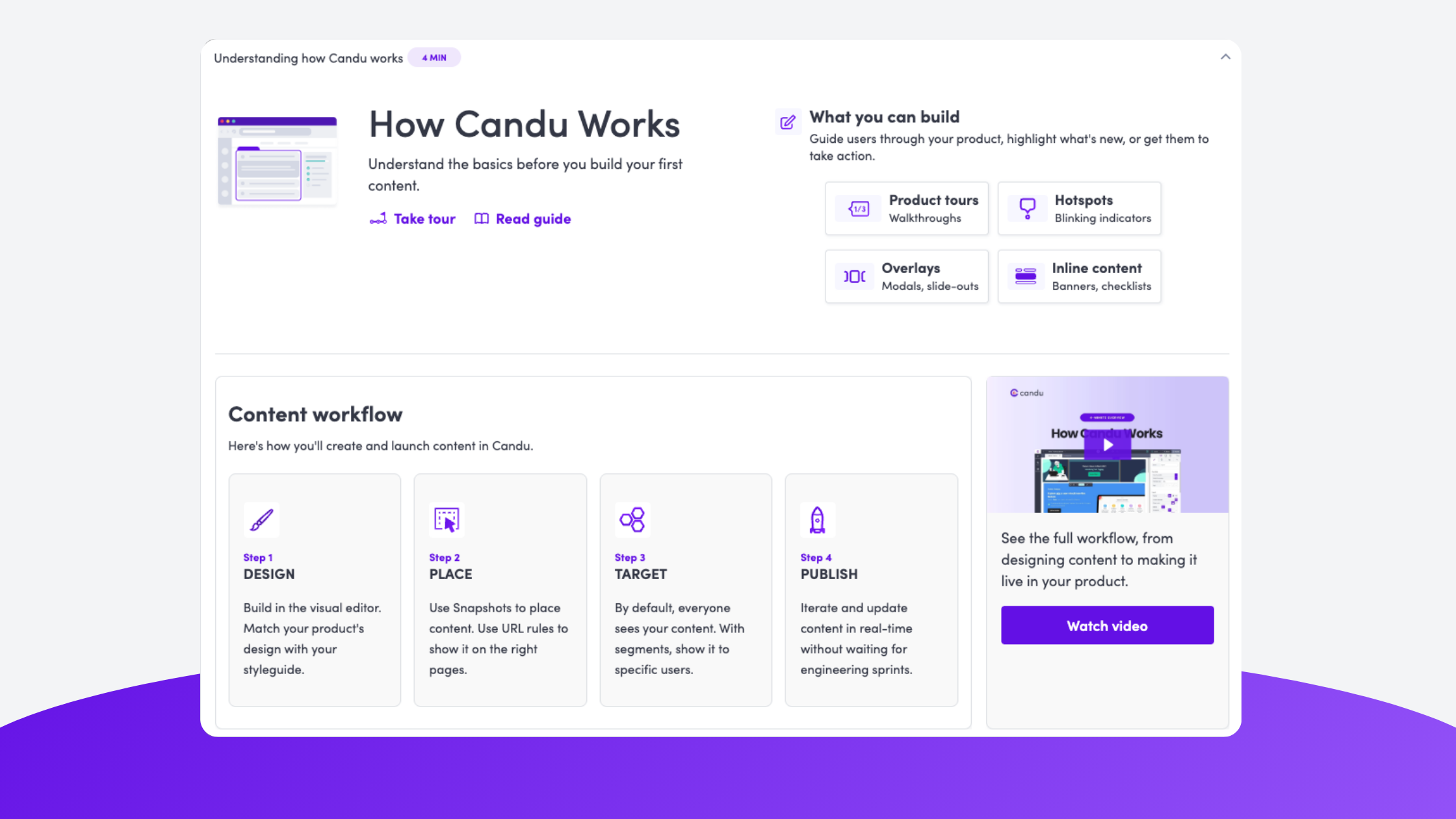
The breakthrough came when Deborah started with documentation. Rebuilding our help center forced her to map out the content workflow: Design → Place → Target → Publish. Once that mental model was clear, everything else followed.
This mirrors what we've seen work for customers. When teams focus on teaching the mental model first—not just features—users become self-sufficient faster. It's why companies that build progressive onboarding systems see better activation than those relying on single welcome flows.
Key insight: Documentation isn't just for users who need help—it's for you to understand what you're actually teaching.
We didn't build one onboarding experience. We built eight different touchpoints that work together:
Before anything else, we ask what you're trying to accomplish. This shapes which templates and guidance we show you.
This was our most important addition. Instead of showing users around the editor with disconnected tours, we created a checklist focused on one outcome: publishing your first content.
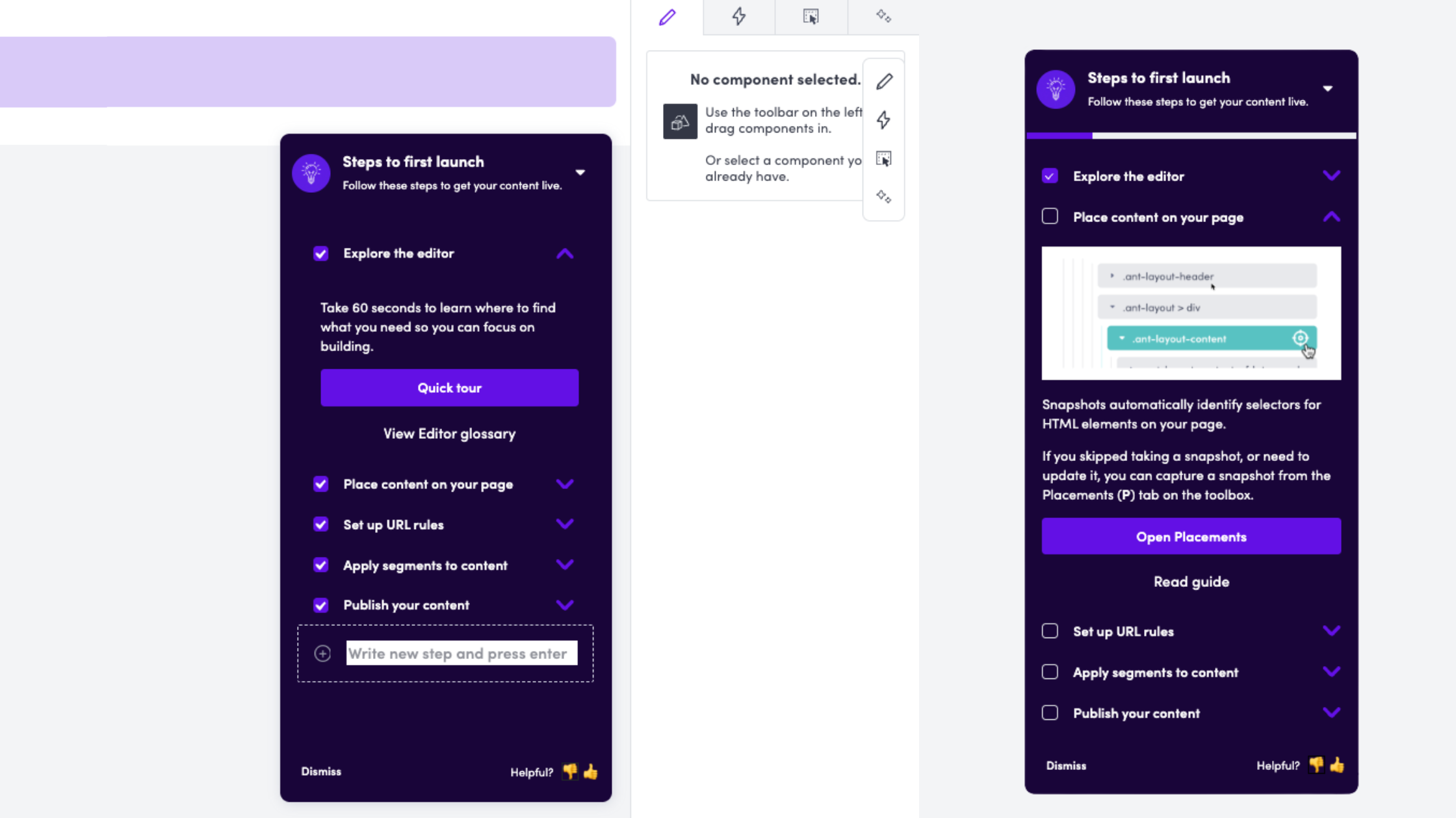
The checklist lives inside the editor—right where users need it. Each step is outcome-focused:
When you complete a step, the checklist reminds you what you just did, reinforcing the learning. The checklist also shows relevant guides for each step and the CTAs point users to the sections they'll need to help them get familiar.
Each checklist item opens a short tour that shows you exactly where to click and what to do. These aren't comprehensive walkthroughs—they're focused on immediate next actions.
New accounts see a dashboard that explains the content workflow at a high level, with links to take a tour, read the guide, or see what you can build.
Instead of dumping users into a blank canvas, we show templates organized by what you're trying to accomplish: user onboarding, announcements, conversion & retention, forms & feedback.
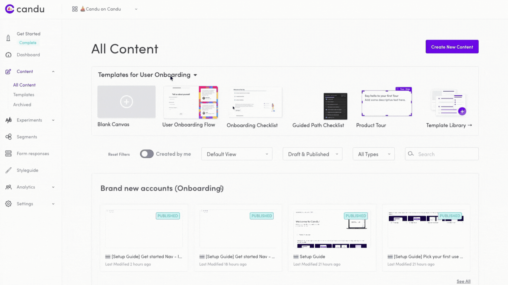
Each section of the product—Segments, Form responses, Experiments—has inline help explaining what it does, with links to tours, tutorials, and guides. We added this to empty states too, so users aren't staring at blank pages wondering what to do.
.gif)
When team members join an existing account, they see a modal asking: Do you want to build from scratch, start with a template, or take a guided tour? Different roles have different needs.
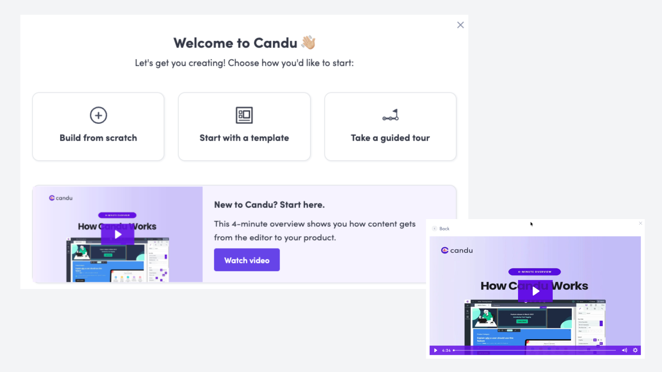
A 4-minute walkthrough of the entire workflow—from editor to published content. Visual learning for people who prefer it.
In-product experiences are crucial, but users don't live in your product. They leave, get distracted, forget what they were doing. Email brings them back at the right moments.
We built an education series triggered by user behavior:
The key insight: these aren't Day 1, Day 2, Day 3 emails. They're triggered by what users do (or don't do). Someone who publishes content in their first hour doesn't need the same emails as someone who creates content but gets stuck on placements.
Each email drives users back to a specific in-product experience—a checklist, a tour, a template. They're not standalone lessons; they're bridges between product sessions.
Building onboarding is harder than it looks. You're constantly making tradeoffs:
Comprehensiveness vs. simplicity. Deborah was tempted to add steps about analytics and A/B testing to the checklist. But more information can be overwhelming. We stuck to the core job: publishing your first content. Everything else can come through progressive discovery later.
In-context vs. centralized. Users want information where they need it, but that means fragmenting your onboarding across multiple surfaces. We had to balance contextual help with a coherent narrative.
Technical accuracy vs. accessible language. Web pages are complicated. Terms like "selector," "snapshot," and "placement" are necessary but confusing. We had to introduce technical concepts without overwhelming non-technical users.
Speed vs. polish. Deborah used AI to generate initial designs for the checklist and tours, then iterated in the editor. Getting something in users' hands quickly was more valuable than perfection.
We didn't guess. We measured:
The goal isn't zero questions—it's to move users from tactical confusion to strategic thinking.
If you're redesigning onboarding, here's what worked for us:
Get clear on the steps to success. What does a successful user actually accomplish? For us, it's publishing their first content. Everything should ladder up to that outcome.
Map the customer journey. Where do users get stuck? What do they misunderstand? Talk to customers before you design anything.
Think in systems, not flows. Don't build one big onboarding flow. Build multiple touchpoints that reinforce the same mental model in different contexts.
Provide in-context help everywhere. Don't make users leave the page to find information. Put snippets, tooltips, and links exactly where they're needed.
Use real customer language. We pulled questions directly from support conversations and used them to frame our help content. "What's a placement?" became a help article title.
Start with documentation. It forces you to clarify your own thinking and gives you reusable assets for in-product help.
Measure both quantitative and qualitative outcomes. Usage metrics matter, but so does the quality of conversations you're having with customers.
The most interesting thing about this project? We used Candu to build Candu's onboarding. Every checklist, tour, and modal was created in our own product. That forced us to confront the same challenges our customers face.
If you can't successfully onboard yourself with your own product, how can you expect your customers to?
We've packaged our entire onboarding system—checklists, tours, email sequences, contextual help—as free templates you can copy and customize for your own product.
No gatekeeping, no lead forms. Just practical assets you can use today.
Try the interactive demo → (See how it all works together in an Arcade walkthrough)
Or if you want to talk through your specific onboarding challenges, schedule time with our team.
This post was based on an interview with Deborah Ramirez, Customer Success Manager at Candu, who led the onboarding redesign project.


.gif)