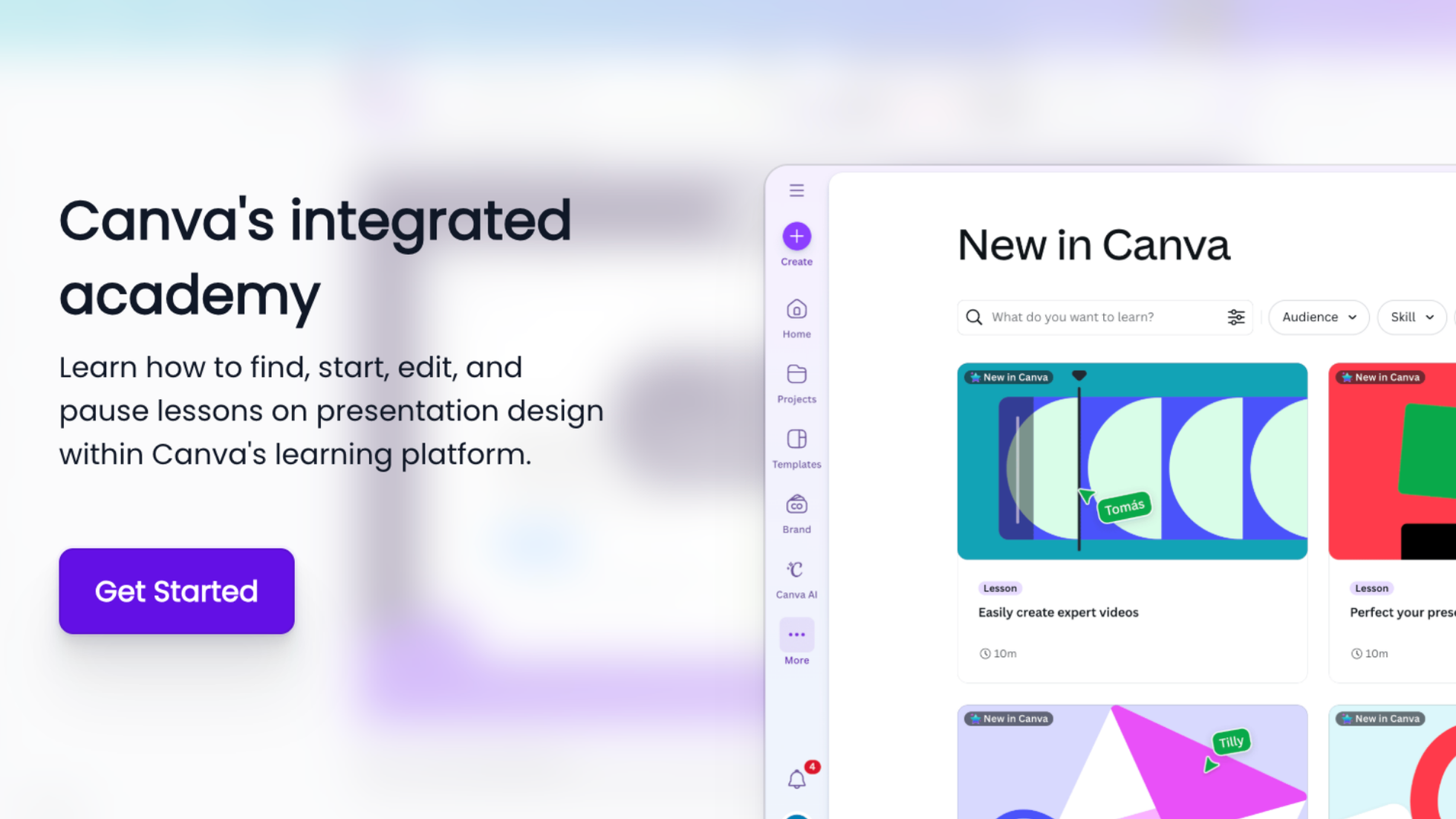
Most users will never read your help docs. Not because they're lazy - because context-switching kills momentum. Canva understood this and built a $40B valuation on one principle: Education happens where work happens.
According to Pendo's 2023 State of Product Adoption Report, as few as 12% of features in most SaaS products drive 80% of user value. The rest become expensive shelf-ware. Yet Canva has achieved consistently high feature adoption across their entire suite. Their secret? They turned education from a support cost center into a core product feature.
In my conversation with Canva's Growth Lead Salva Torres, he revealed how they think about user education: "The moment someone has to leave your product to learn it, you've already lost them." This guide breaks down exactly how Canva implements this philosophy through what I call the "Contextual Learning Loop"—and how you can steal their playbook.
Canva's approach isn't just about better tooltips or slicker onboarding. It's a fundamental rethinking of how education integrates with product experience. Let's dissect each layer using real examples from their interface.
Look at how Canva introduces new features. Instead of email blasts announcing "What's New in December!", they place a visually striking prompt directly in the editor: "New launches for the imagination era." This isn't random—it's behavioral science in action.

The prompt appears when users open the editor—a moment when they're already committed to creating something. They're not browsing; they're working. This timing leverages what psychologists call the "implementation intention"—when someone has already decided to act, they're more receptive to tools that help them act better.
Most SaaS products follow this pattern:
The problem? These announcements exist outside the user's workflow. As our Genially case study showed, moving from email announcements to in-app contextual guides increased their activation rate by 25%.
1. Relevance: Match education to the user's current workflow stage
2. Recency: Surface new features while they're still novel
3. Reward: Promise clear, immediate value
Here's where Canva gets brilliant. Click through to their "New in Canva" dashboard, and every lesson card displays three critical pieces of information:
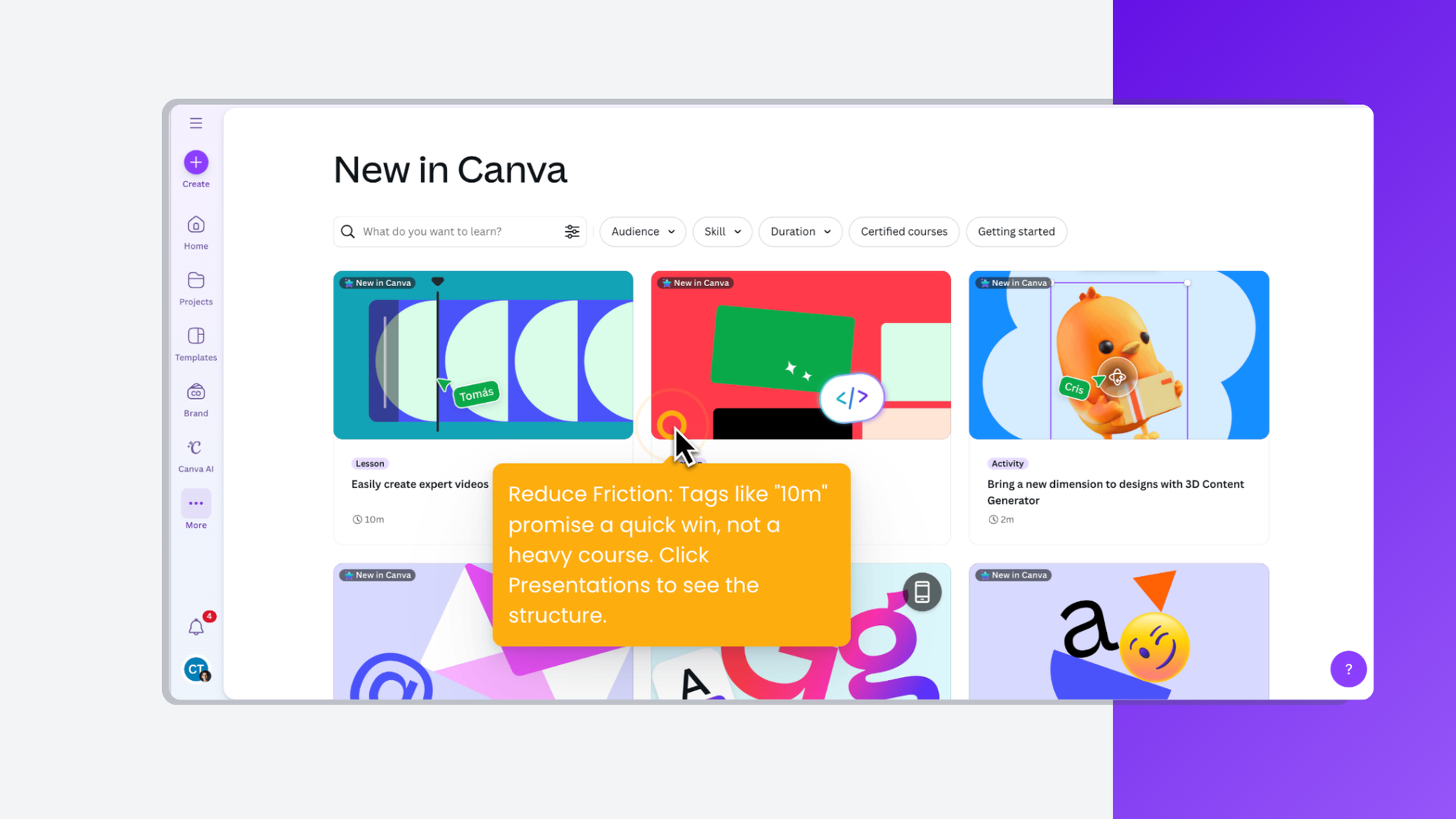
This transparency respects what I call the "User's Mental Budget"—the finite amount of cognitive energy someone allocates to learning new tools. When users know exactly what they're committing to, they're 3x more likely to start (and finish) the lesson.
Notice how Canva doesn't overwhelm you with 50 courses. The initial view shows 3-6 options, with clear categorization:
This prevents what UX researchers call "choice paralysis,” which when too many options lead to no action at all. Candu implements this through our smart segmentation, showing different lesson priorities based on user role and past behavior.
Download Canva Academy complete walkthrough documentation PDF
This is Canva's killer innovation. Click "Start lesson" and watch what happens:

The screen splits. On the left: bite-sized instructions. On the right: a real, functioning canvas. Not a video. Not a simulation. The actual tool.
Users see: "Drag the square icon to add text" Users do: Actually drag the icon Users learn: Through muscle memory, not memorization
Crucially, Canva creates a separate lesson project—users aren't experimenting on their actual work. This removes the fear of "breaking something" that prevents exploration. The pre-populated "Speak with no fear" template gives users professional assets to work with, making the practice feel real and valuable.
Traditional video tutorials suffer from the "YouTube Problem"—users watch passively, feel like they understand, then immediately forget when they try to replicate the action. Interactive documentation tools show that hands-on learning has 68% retention after one week, compared to 23% for video.
What it looks like: Highlighting every UI element when users first log in
Why it fails: Information without context is just noise
What to do instead: Introduce features when users need them, not before
What it looks like: Forcing users through 10 steps before they can use the product
Why it fails: Users want to explore on their terms
What to do instead: Make learning optional but irresistibly valuable
What it looks like: Same popup for all users regardless of their workflow
Why it fails: Irrelevance breeds banner blindness
What to do instead: Segment announcements based on user behavior
What it looks like: Separate learning portal that requires login
Why it fails: Context-switching kills momentum
What to do instead: Embed learning in the product interface
Based on our work with 50+ B2B SaaS companies implementing contextual education:
What makes Canva's approach powerful isn't just the immediate adoption—it's the compound effect:
This is how education becomes a growth loop, not a cost center.
Track these metrics:
Here's the paradigm shift: Stop asking "How do we document this feature?" Start asking "How do we make users successful with this feature?"
Canva doesn't just teach features—they create confident users. Their Academy isn't hidden in a help center; it's woven into the fabric of the product experience. Every lesson completed is a mini-transformation: from someone who doesn't know to someone who does, from hesitant to confident, from viewer to creator.
The best part? This isn't proprietary to Canva. With the right tools and framework, any product team can implement contextual education. The question isn't whether your users need better education—it's whether you'll deliver it where they actually are, or continue hoping they'll find your help docs.
Your move: Pick your most underused feature. Give it the Canva treatment. Measure what happens. Then scale what works.
Because in the end, the products that win aren't just the ones with the best features—they're the ones that help users actually use them.
Ready to implement contextual education in your product? Explore Candu templates or read how Genially achieved 25% better activation with this approach.


.png)