A new Genially user lands on the dashboard. A playful card invites them to learn by doing. They click. A tour begins inside the editor, not on a help page. Each step reacts to real clicks. A tiny flag moves. Progress feels earned. The brand voice is present in every detail.
This is how Genially’s growth and education team, led by Paula Pla Azanza, uses Candu to turn delight into activation. There are no heroics here, just repeatable patterns, careful craft, and a clear sense of what helps users make something.
“We lead with delight, and every moment moves you forward.” — Paula Pla Azanza
The work is beautiful, but it is also measurable.
See for yourself. Click through their Editor onboarding 👇
Before users enter the editor, they’re greeted with a quick orientation tour.
.gif)
Pattern: Dashboard card → “Show me” → tour starts inside the editor.
Why it delights: Users opt in, so intent is high. Steps can progress when the user clicks the target element. No context switch.
Builder notes: Built with Candu’s interactive product tours. For extra interactivity, set a Trigger click so tapping Next doesn’t just advance the tour, it clicks the coded element as well. Add a light backdrop for focus and start the tour when users click on the next checklist item.
How do you encourage users to opt-in to onboarding? You A/B test. Genially experimented with how to motivate users to choose to onboard.
Can you guess which of these worked best?
.png)
The variant that removed “Skip tour” and simplified the copy drove more opt-ins to the editor journey. Microcopy clarity, a single primary CTA, and a shorter visual rhythm made a difference.

An invitation, not an interruption: Once in the Editor A simple modal invites users to opt in to the checklist and the mini tours.
A lean checklist: A lean checklist appears in the editor (three to five tasks tied to first value). Several items appear completed already, so progress feels real from step one. Completion opens a small celebration. Progress feels real from the first view.
Very interactive: Enable user clicks target to progress so steps advance on real actions.
Builder notes: Build with conditional logic, Step 2 is checked when users click the continue button in the opt in modal. Completion modal with “see more” or “try another.”
What happens: Each checklist item opens a short micro-tour in the Genially editor. When the user advances the tour step, Candu fires a click on the target element in Genially. Genially’s editor reacts live, the step completes, and the user snaps back to the checklist with the item checked.
Why it works: It feels like creating, not reading. Guidance shows up only when needed. Progress is visible.
“Tours are invitations, then the checklist keeps you creating.” — Paula Pla Azanza
How it’s built
See for yourself. Click through their Editor onboarding 👇
What it is: An in-product feed of release notes that opens in a modal. The left rail lets users switch sections. The right pane is a scannable stream of update cards. Cards can include a micro-video or a Genially embed, plan chips, and links to Learn more or the Academy.
Why it works: Users browse updates without leaving the app. Motion helps them understand in seconds. The feed feels native, not like a separate changelog.
“Candu lets us customize like it is native Genially. When we want more motion, we embed a Genially inside.” — Paula Pla Azanza
Build it
Measure it: Feed opens → card impressions → video plays → clicks to Learn more or Academy → downstream feature use.

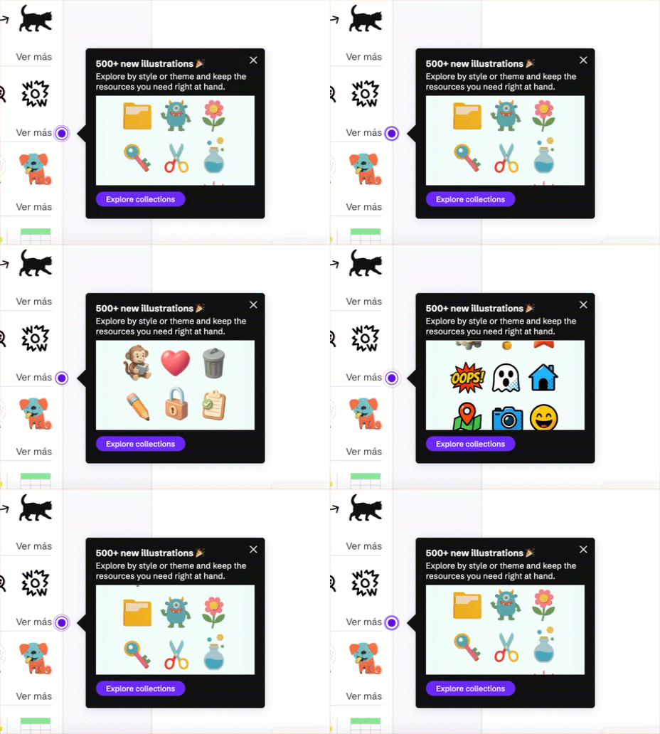
Alongside the Updates modal, Genially uses contextual hotspots to nudge discovery in context. Copy is one short line. One verb, one noun. Many hotspots use a tiny visual built in Genially for a touch of motion.
Why it works: Discovery happens where intent is high. Copy stays short and specific. Motion can be added with a tiny Genially loop for a touch of delight.
Build it
Measure it: Hotspot impressions → clicks → completion of the hinted action.
Genially closes the loop with a two-step in-product form. Step one is a quick 1–10 rating. Step two asks what worked best. It takes seconds, and users never leave the page.
.gif)
The gamified version of the checklist outside the editor looked great, performed worse. The in-editor checklist plus micro-tours won because they sit where creation happens.
.gif)
“The out-of-context version was gorgeous. The in-editor version won.” — Paula Pla Azanza
Let the checklist help understand what they need to do. Use a lightweight tour to show users how to complete each step. Use the opt-in modal to invite the next step and pre-check progress from actions users already took.
Genially A/B tested the onboarding modal. Removing Skip, tightening the headline and subhead, and keeping one primary CTA increased opt-ins to the editor journey.
Advancing a step makes Candu trigger the click in the Genially editor. The page responds, the step completes, and the checklist item checks off. That interactivity helps new users engage.
New users don’t need to learn about new features. Trigger hotspots only after new users have activated onto core experience.
Population: newly registered users, first week.
Control: no help. Test: tour → opt-in modal → editor checklist.
Source: Genially internal analysis, published with permission.
Genially teaches by creating. Guidance that interrupts feels off-brand. Guidance that co-creates feels like magic. Beauty is not at odds with outcomes, it’s a multiplier for them. The checklist keeps momentum. The tour forms the habit. The releases feed showcase what’s new without leaving the app. Hotspots add small, contextual nudges while people explore.
Candu makes this level of customization possible at speed. When the team wants extra motion, they build the visuals in Genially and embed them inside Candu, then track what users watch and click next.
