
Stop poking your users with generic pop-ups. Here is the 5-layer framework for converting Power Users into Team Accounts using psychology and context.
The Problem: Most in-app upsell strategies feel like 'poking' the user. They rely on generic 'Upgrade Now' banners that interrupt workflows and annoy the exact people you're trying to retain. But what if you could make users actually want to see your upgrade prompts?
The winning strategy isn't about shouting louder; it's about Contextual Layering.
The Solution: We’ve developed the "Expansion Stack"—a framework of five specific UX patterns that target different psychological triggers at different moments in the user journey. Here is how to build it.
Before you build a single pixel, define your PQL (Product Qualified Lead). You cannot treat a Day 1 user the same as a Day 90 Power User. Use your data (Segment, Salesforce, or Mixpanel) to identify the cohort that has hit a usage limit or demonstrated high intent. For example: users who've invited 3+ teammates but haven't upgraded, accounts hitting 80% of their free tier limits, or power users who've been active for 30+ consecutive days.
Only show the following layers to them.
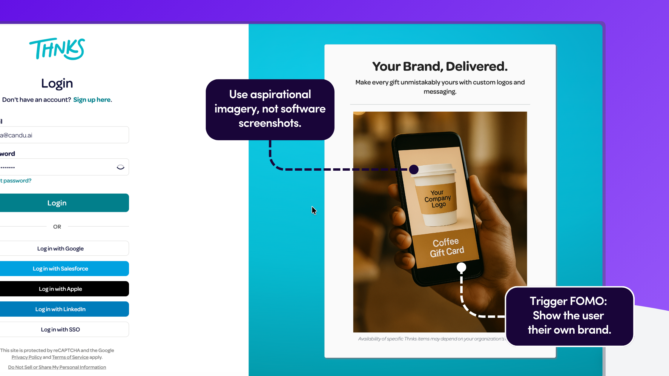
Where: The Login Page or Home Screen. The Psychology: FOMO (Fear Of Missing Out).
You can’t always segment users perfectly before they log in. But you can use the "front door" of your product to create aspiration. Instead of a generic login screen, show the "Perfect State" of your product—features that validate your Enterprise clients but make your Free users envious.
The Pattern: Replace generic product shots with "Lifestyle" imagery of premium features. For example, if you are a gifting platform, don't show the software; show a physical coffee cup with a Custom Company Logo on it.
Once they're logged in, the journey continues with recognition, not sales pressure.
Where: The Dashboard. The Psychology: Reciprocity and Status.
Power users don't want to be "sold to," but they do want to be recognized. Borrow a page from airline loyalty programs: treat the upgrade eligibility as a Status, not a purchase.
The Pattern: Instead of a "Buy Now" banner, place a persistent "Status Card" or "Account Review" module on the dashboard. Frame the call-to-action as a service. Instead of 'Upgrade to Team Plan,' try 'You've sent 500+ gifts this quarter. Schedule your free account optimization session.' This mirrors how Gorgias uses 'Book Demo' instead of 'Buy Now'—it's about starting a conversation, not closing a sale.
.png)
Status recognition opens the door, but the real conversion happens when users try to do something they can't.
Where: When a user clicks a locked feature. The Psychology: High Intent.
This is the highest leverage moment in the user journey. The user has explicitly tried to do something (e.g., "Upload Logo" or "Export 4K Video") and hit a wall. Do not just show a "Access Denied" error.
The Pattern: Use a Feature Lock Modal that "teases" the value. Show a visual comparison of the "Current State" vs. the "Unlocked State." Stack the value props immediately: "Upgrade to unlock Branding AND save 20% on fees."
You've shown them what they're missing. Now capitalize on their completed actions.
Where: Immediately after a success event. The Psychology: Loss Aversion.
Humans hate losing money more than they enjoy gaining features. If your pricing model involves transaction fees or usage limits, the best time to upsell is right after they have "overpaid" or "wasted" a credit.
The Pattern: A Contextual Slide-Out that appears seconds after a task is completed.
.png)
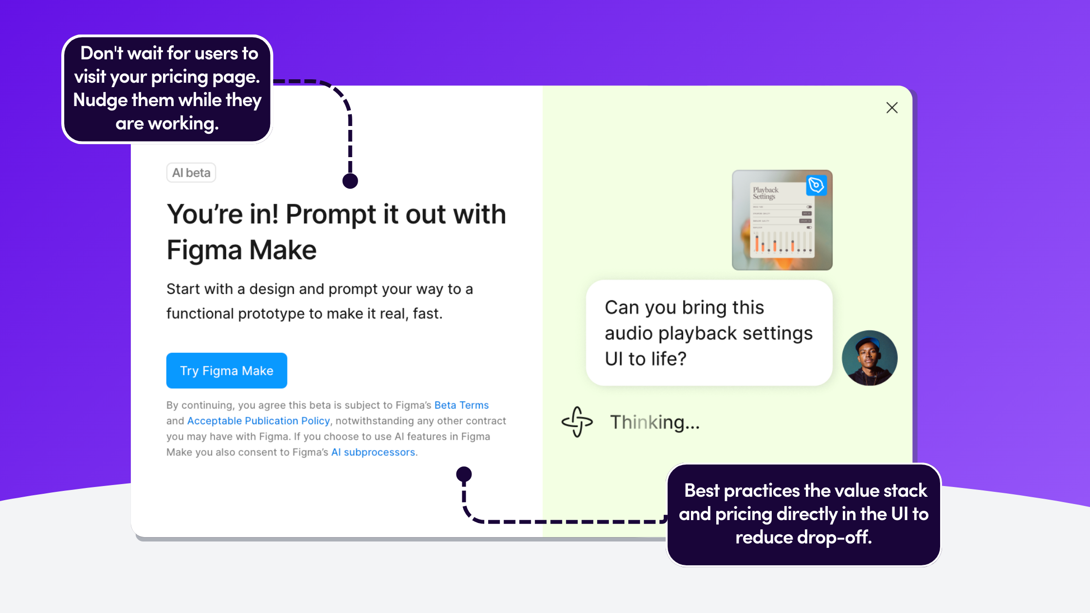
Where: The Pricing Page or Upgrade Modal. The Psychology: Reducing Friction.
For B2B upgrades, a credit card form is often too much friction. Users may need to negotiate seats or ask about security. If you force them to "Contact Sales" via a generic form, you lose momentum.
The Pattern: Embed the calendar directly into the product. Use an In-App Pricing Page that allows for self-serve or immediate booking.
.png)
This framework works because it follows the same principles we've seen in successful product launches—progressive disclosure and contextual value. The key is meeting users where they already are, not where you want them to be.
The difference between annoying your users and converting them isn't about frequency, it's about context. Start with just one layer (we recommend Layer 3, the feature lock) and measure the difference. You'll quickly see why contextual beats generic every time.


.png)

.png)
.avif)