Three months, eight sprints (hackathon + design sprint included), one giant leap: how we turned a power‑user tool into something anyone can steer with a prompt—without throwing away a single pixel of our editor.
“Wait—you’ve invested years in a drag‑and‑drop UI, and now you’re telling me to just chat at it? Do I ditch the editor?”
Short answer: No.
Long answer: AI lets you keep every bit of flexibility and erase the learning curve. Here’s how we turned a five‑year power‑tool into chat‑powered ‘vibe‑code’—without throwing out our Editor..
(Our CTO, Stu, is writing a technical deep‑dive on how we wrangled LLM tool calls, integration tests, and multi‑step planning—stay tuned.)
Why we took the plunge
Candu’s drag‑and‑drop editor has long been the most flexible way to ship in‑app UX without engineering help—and the hardest to master. We knew AI could collapse that trade‑off, but the path was foggy: model costs, hallucinations, brand safety, new UI grammar. So we made a bet—rewrite the business for AI or get left behind—and spent six weeks proving we could:
Draft on‑brand copy, layouts, and images in seconds.
Keep everything safe through guards, flags, and instant undo.
Teach new users faster than we’d ever taught power users.
Below is the play‑by‑play, the bruises, and what’s next.
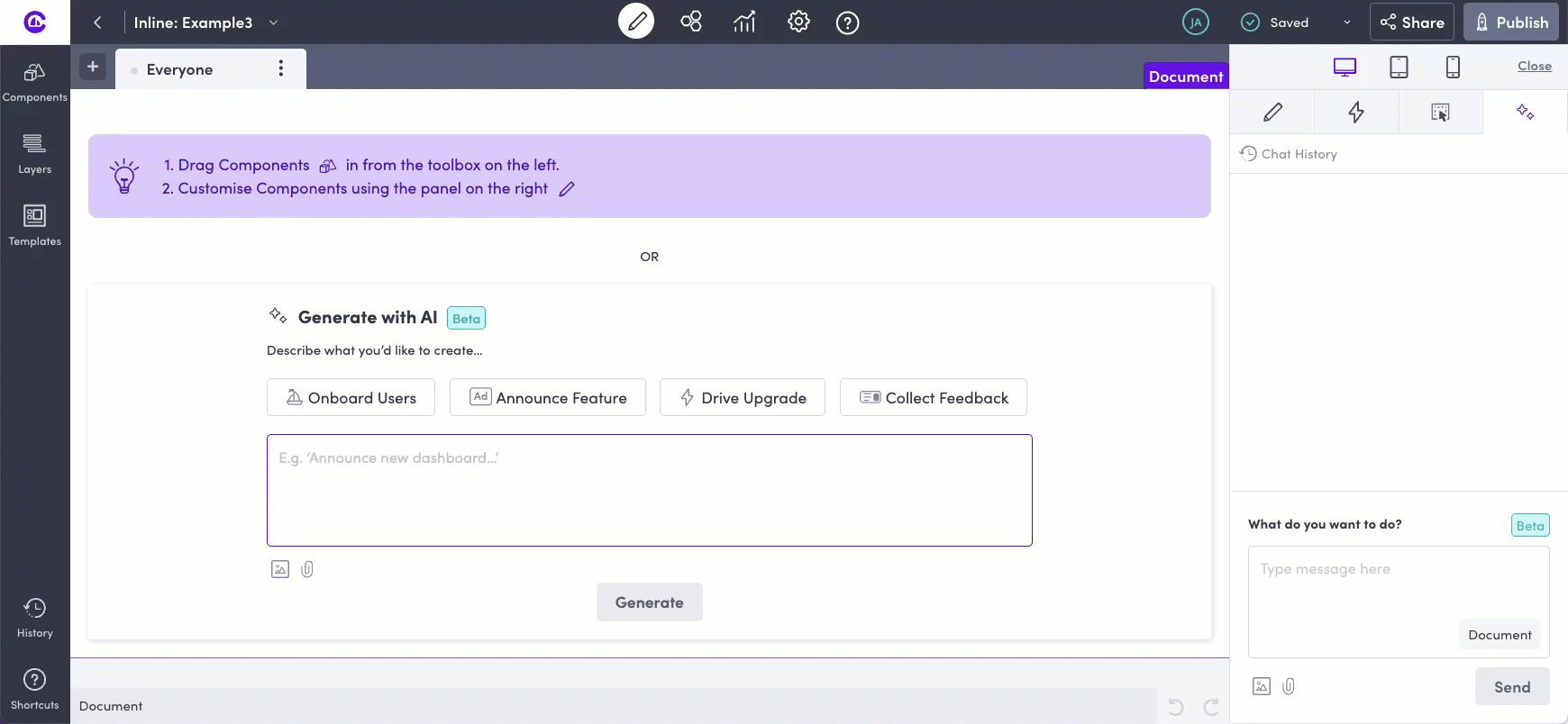
1. Set the problem—make the editor easy
“I have lots of product ideas and very high standards, but I can’t code … That used to slow me down.” – Jonathan Anderson, Co‑founder
Problem statement:
Let any product owner redesign UI, in context, in under five minutes—no manual reading, no Figma hand‑offs.
Everything that didn’t serve that goal (AI segments, etc.) would need to wait.
2. Build on user muscle memory—don’t replace it
🚫 Rebuild the editor ✅ Let AI super‑charge it*
Stay in context. Our Snapshot engine means you edit where components live—not in Vibecoding‑style sandboxes that break prod (ask us how I nuked our Webflow site 🙈).
Power ↔ simplicity. Prompts set the layout; drag‑and‑drop tweaks the details. With AI, the famous “flexibility vs ease” slider stops being zero‑sum.
Live & breathe the ecosystem. We used Cursor, Loveable, ChatGPT, and tuned in to Hard Fork every week; you can’t design good AI UX in a bubble.
Solve for occasional users. We learned from launching our AI product that AI translations delight occasional users even more than power users.
3. Finding where AI wins
Magical moments often showed up in tiny, obvious‑in‑hindsight prompts:
“Translate this flow into German.” — done before they finished the sentence. “Dark‑mode this page—brand colors only.” — instant, AA‑accessible, on‑brand. “Pull colors from our brand.” — You can get 80% of the way there to set up your brand by pulling from a URL. It’s not always pixel perfect, but it is impressive.
These “wow” moments seem intuitive now, but pop in demo (and save a lot of fiddling). Once you spot one, reel it in. Make the instructions more clear so the bot nails them (most) of the time.
Then, you can add these clearly defined ‘wins’ as ‘recommended next action’ chips - what we’re calling “edit chips” so more users can discover them in the moment and be delighted by them.
Guardrail
Why it matters
How we shipped it
Feature flags & kill-switch
Turn AI off for a plan tier or when latency spikes
LaunchDarkly wrapper around every endpoint
Content & policy filters
No brand-damaging or illegal output
OpenAI moderation → custom regex → allow-list
No raw code generation
LLM-generated code can break prod
Copilot can only create/edit pre-vetted components
Undo stack
Risk-free generation (and re-generation)
Every AI action logs to history; one-tap undo
5. AI learnings by doing 🤓
Little agents, big lessons
Specialized mini‑models beat one big brain. A “fetch‑URL” agent blocks other reasoning, so we run it separately, pass the HTML back, then let the LLM act.
Images are budget‑eaters. They’re ~30× the cost and ~10× the latency of text. We cache, resize, and pre‑generate fallbacks.
Chat context is fragile. Power users paste novels; low‑confidence users send one line. We trim with a scoring system so GPT stays under 16k tokens.
Steaming APIs helps speed and quality.New streaming APIs enabled our models to work and then rework the problem. The difference is between getting it right in one shot (very challenging) and letting the AI evaluate its content and then continue to finesse (very cool).
Logs > gut feel. Every prompt/response is tagged, diffed, and searchable—nothing fixes hallucinations faster than replaying them.
How confident is your AI? We spent a long time trying to coach our AI to ask for context when needed, to keep responses concise and clear and to ‘do more’ actions within the editor
Create Chips - Like Airtable’s new agentic onboarding flow, help new users by giving them ‘create’ chips that help them build the right prompt. It will also open their eyes to the core uses we know we can deliver within our product.
Be clear about what AI can’t do.
With an open chat box, users will ask almost anything. Too bad then, that our AI models can’t do everything, yet. Once it became obvious about the breadth of requests, it was helpful for us to design a micro framework:
Things are product does not do → Tell the user it’s not possible
Things that our product does, but the AI does not → Help the user find the answer in the help center
Things that our product does not do yet → Let the user know this is coming and show them what to do first
Things that our AI does → Let the AI rip.
Want the technical story? Our CTO will post a deep‑dive on tool calls, integration tests, and more next week.
6. AI transparency
Terms & DPA refresh. We added a plain‑language AI appendix, model sub-processors, and refreshed our data‑retention window. (candu.ai/dpa)
Account opt‑outs. Workspace owners can decide whether their teams have access to new AI features. .
Audit logs. Candu AI needs to feel safe and to be secure. The best way to do that was for us to maintain a history of all the logs and make those accessible to the owner.
8. Lessons from 10 pilot customers
Delighters
Big Undo Button. “I can see what changed—feels safe.”
Real-time edits. Copy + layout + icons in one go.
Struggles
Reference‑icon confusion. As it turns out 📎 does not mean upload.
Images remain hard. Aspect ratios are limited; images take a very long time. If it’s not perfectly on brand, it won’t make the cut.
Collateral‑damage fear. AI can and will get things wrong. We need to accept/reject per change and an escape hatch when users started to get frustrated.
Fixes before GA Onboarding nudge · ? helper · Plain‑language errors · Concise replies · Scoped refusals.
9. What we’d tweak next time
Recruit more low‑confidence users. Power users push edge cases; novices reveal clarity gaps.
Spend more sprint time on chatty‑vs‑action balance. The earlier we tuned verbosity and field count, the more fun it was to work with our bot.
Earlier latency budget. “2× slower than human” is the line.
Fewer fields per chat. Long conversations degrade model quality—spin a fresh thread.
Universal ✨ icon. Everyone recognizes it; use it on contextual buttons, not just the sidebar.
10. What’s coming 🔜
Figma → Candu import: We know many designs start in slack. Our goal is a one-click import.
Auto‑layout: Responsive layouting is hard to master – we’re going to beef up how the model handles improving and varying designs: think “put this in a column” or “optimize for mobile. My favorite prompt: “Make this look pretty.”
Natural language segments: Show this modal to returning users in candu on Tuesday if they aren’t in their first 30 days.
Auto‑optimize: A personal favorite: The AI should be looking at best-practices and measuring your content’s engagement data to suggest how to improve the UX. Too often, UX gets stale. Instead it should be a living, breathing thing - always improving as users play with it.
So join the beta, break things, tell us what hurts—and help us figure out what to build next.
Join the waitlist
We’re rolling the beta out gradually—Enterprise plans first, then wider tiers. Free and lifetime plans aren’t included until we figure out metered pricing..

.gif)


.png)
.png)

